It can be hard to communicate with a design team on a project when the designers speak their very own language. That’s why we have a rundown of words you may come across frequently that can save you from an artwork mishap or miscommunication! Bookmark this cheat sheet of graphic design terms and you’ll be speaking our language!
How to avoid an “Oh, crop” situation…
We promise we’ll keep the design puns at a minimum, but if you have ever gotten your wires crossed on a print ad and didn’t instruct a designer to include bleed and crop marks, then you know exactly what we mean when we say, “Oh, crop.” Below is a visual example you can save to help you remember the lay of the land when it comes to printed pieces:
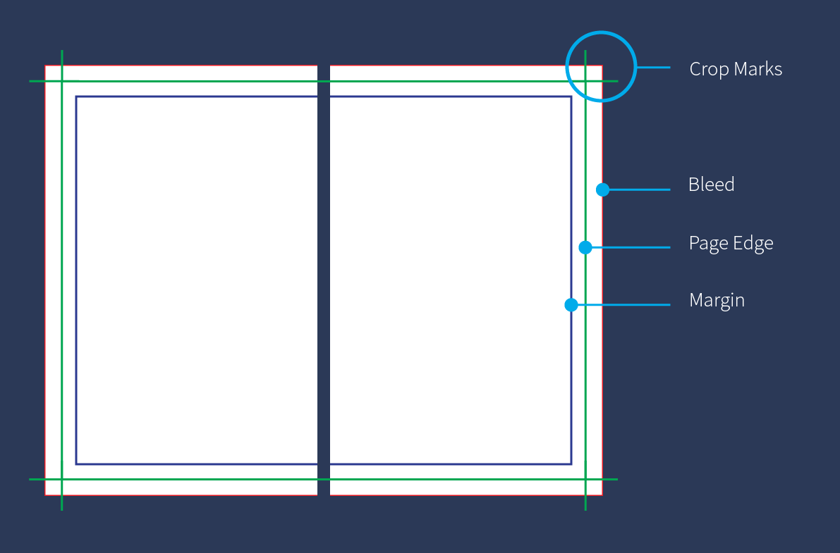
Bleed – when a design extends past the “page edge” or “trim mark,” so there’s no chance of white borders after cutting a printed piece.
Trim mark or page edge – indicate the final size after a printed piece has been cut down. Trim marks accompany crop marks showing where the piece should be cut.
Margin or safety area – anything inside your margin is considered in the safe zone of your printed piece and doesn’t run the risk of being cut off, e.g. your copy or any important content.
Photography & artwork
Rule of Thirds – guidelines breaking down an image’s composition into thirds both horizontally and vertically so you can place the focal point(s) in the most natural viewing position.

Studies have shown the human eye isn’t drawn to the center of a shot, but rather the intersection points of this grid. Using the rule of thirds allows you to capture an image in the most natural viewing position.
Using the rule of thirds may not come all that natural to you if you’re not a photographer, but you can start by asking yourself two questions:
1. What are the main focal points of the image?
2. Where am I intentionally placing the focal points?
And just remember, even if a shot isn’t framed perfectly, you can use the rule of thirds in your editing software to crop and reframe your images!
Typography
The majority of fonts can be categorized into four categories: serif, slab serif, sans serif, and script.
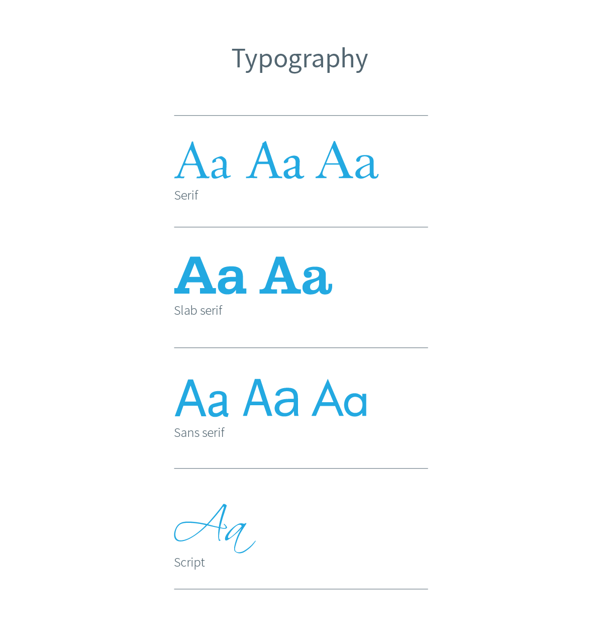
Serif – a small stroke at the beginning and end of the main strokes of a character. Some common serif fonts are Times New Roman, Book Antiqua, and Georgia.
Slab serif – very bold, thick, square-cut serif letters. Sony, Honda, Volvo, and IBM are all great examples of slab serif logos.
Sans serif – meaning without serif, or without any strokes to the end of a character. Some popular sans serif fonts include Arial, Helvetica, and Verdana.
Script – a flowing, cursive stroke imitating handwriting, typically used in design and print pieces as opposed to body text.
You don’t have to know exactly which font you want to use on your next design piece as long as you have these terms handy, you and your designer can be on the same page.
It’s easier to give your feedback on a particular design piece if you know these helpful terms:
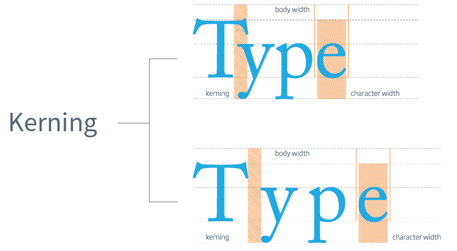
Kerning – refers to the spacing between pairs of letters in the same word. Not all letters are created equal, so certain pairs of letters can appear to form an entirely different letter. For example, the word “learn” can appear to look like “leam” without kerning. With kerning, the designer can create an equal amount of space between letters for more easily readable text.
Leading (pronounced “ledding”) – refers to the space between two lines in a block of text.
Widow text – a single word that falls on the last line of a paragraph creating a visual break in a design piece.
Orphan text – similar to widow text, an orphan word appears on a line of its own usually at the top of a column of text, separated from the rest of the sentence.
Try to avoid these pesky design woes and either edit your copy or see if your designer can adjust the line-length or margins.
A crash course in color
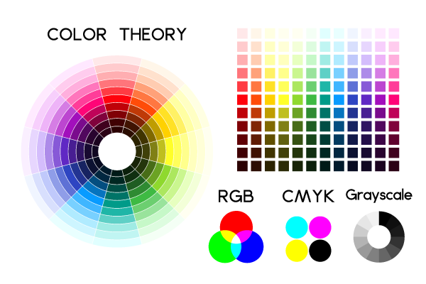
RGB vs. CMYK – These are color modes for images either on a screen or in print. CMYK stands for cyan, magenta, yellow, and key (black). CMYK is used for printing and is often called four-color process or four-color printing. RGB stands for red, green and blue, the three colors of light typically used to display images on a digital screen, like a monitor, TV, or a computer. Keep in mind, if artwork is created in RGB, it might look great on screen however it will print out a different color in CMYK!
Monochromatic – a monochromatic color palette uses various shades of a single color (like a single slice of the color pie in the chart above).
Analogous – colors that are adjacent to each other on the color wheel (e.g. red-orange, orange, yellow-orange). These color palettes are most often seen in nature, like changing leaves for example.
Complementary – colors that are across from each other on the color wheel (e.g. purple and yellow). While complementary colors might be a bit jarring together, this can be used to an advantage when you need a visual element to really stand out.
Getting the swing of it? Having these terms in your vocabulary will allow for a much smoother interaction between you and a designer or design team!


